INDUSTRY: Beauty / Cosmetics
HER BEAUTY IS A PREMIUM COSMETICS BRAND THAT OFFERS:
• makeup products (lipstick, foundation, mascara, etc.)
• skincare essentials
• curated beauty collections
• limited edition luxury packaging
• makeup products (lipstick, foundation, mascara, etc.)
• skincare essentials
• curated beauty collections
• limited edition luxury packaging
THE BRAND AIMS TO COMMUNICATE:
confidence, elegance & modern femininity
confidence, elegance & modern femininity
TONE OF VOICE:
refined, aspirational & sophisticated
refined, aspirational & sophisticated
TARGET AUDIENCE:
• 20–45 years old
• urban, style-conscious women
• premium & luxury buyers
• consumers who value aesthetics and quality equally
• 20–45 years old
• urban, style-conscious women
• premium & luxury buyers
• consumers who value aesthetics and quality equally
PROJECT OBJECTIVE:
Create a high-end visual identity that positions the brand as elegant, modern, and desirable, capable of standing alongside established premium beauty brands.
Create a high-end visual identity that positions the brand as elegant, modern, and desirable, capable of standing alongside established premium beauty brands.
INCLUDES:
• Logo
• Visual System
• Packaging Design
• Retail Experience
• Promotion Materials
• Social Media Assets
• Logo
• Visual System
• Packaging Design
• Retail Experience
• Promotion Materials
• Social Media Assets
LOGO
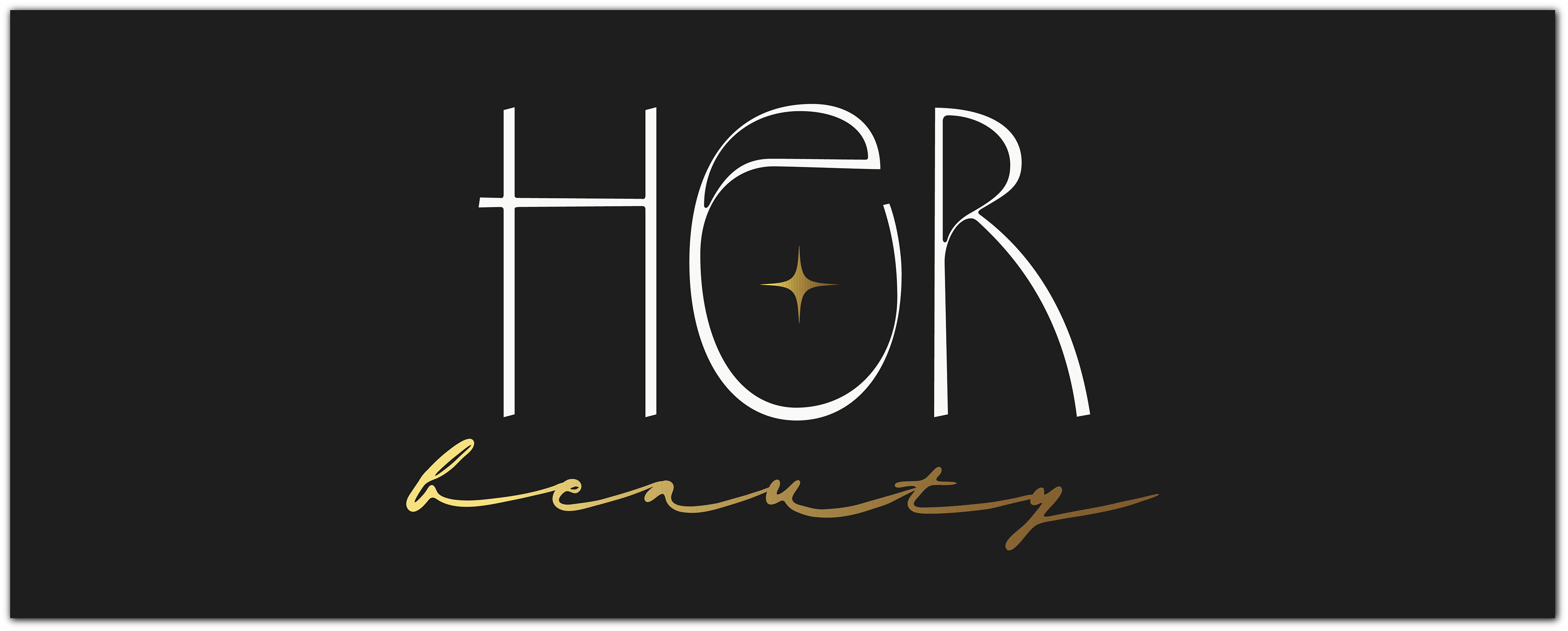
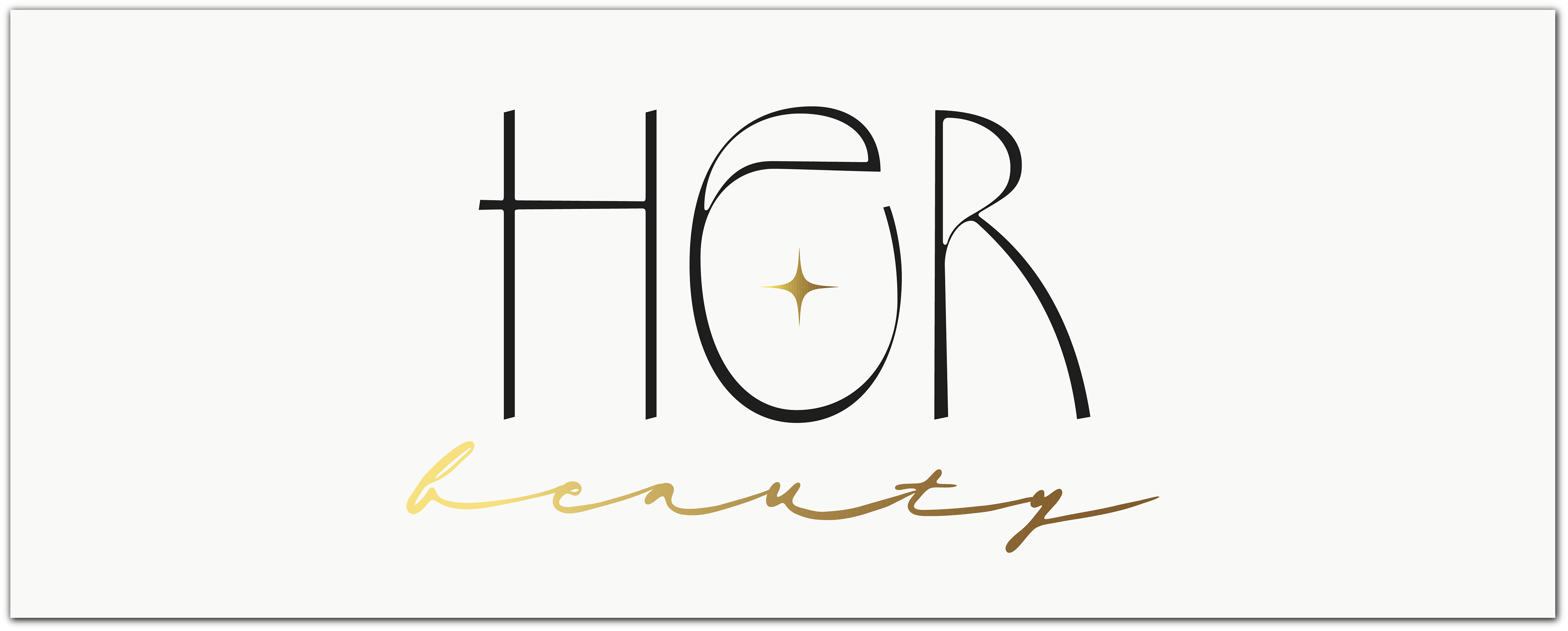
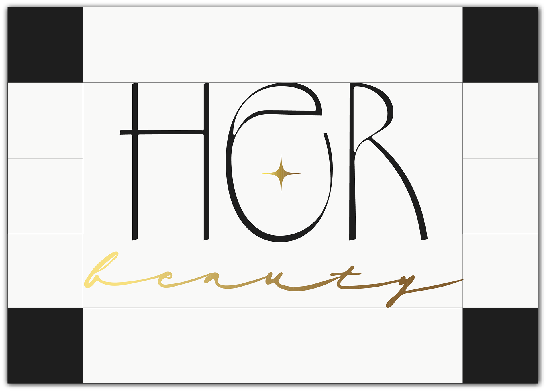
The logo is designed as a minimalist and elegant wordmark with subtle symbolic detailing:
• clean, geometric, cursive letterforms express clarity and confidence;
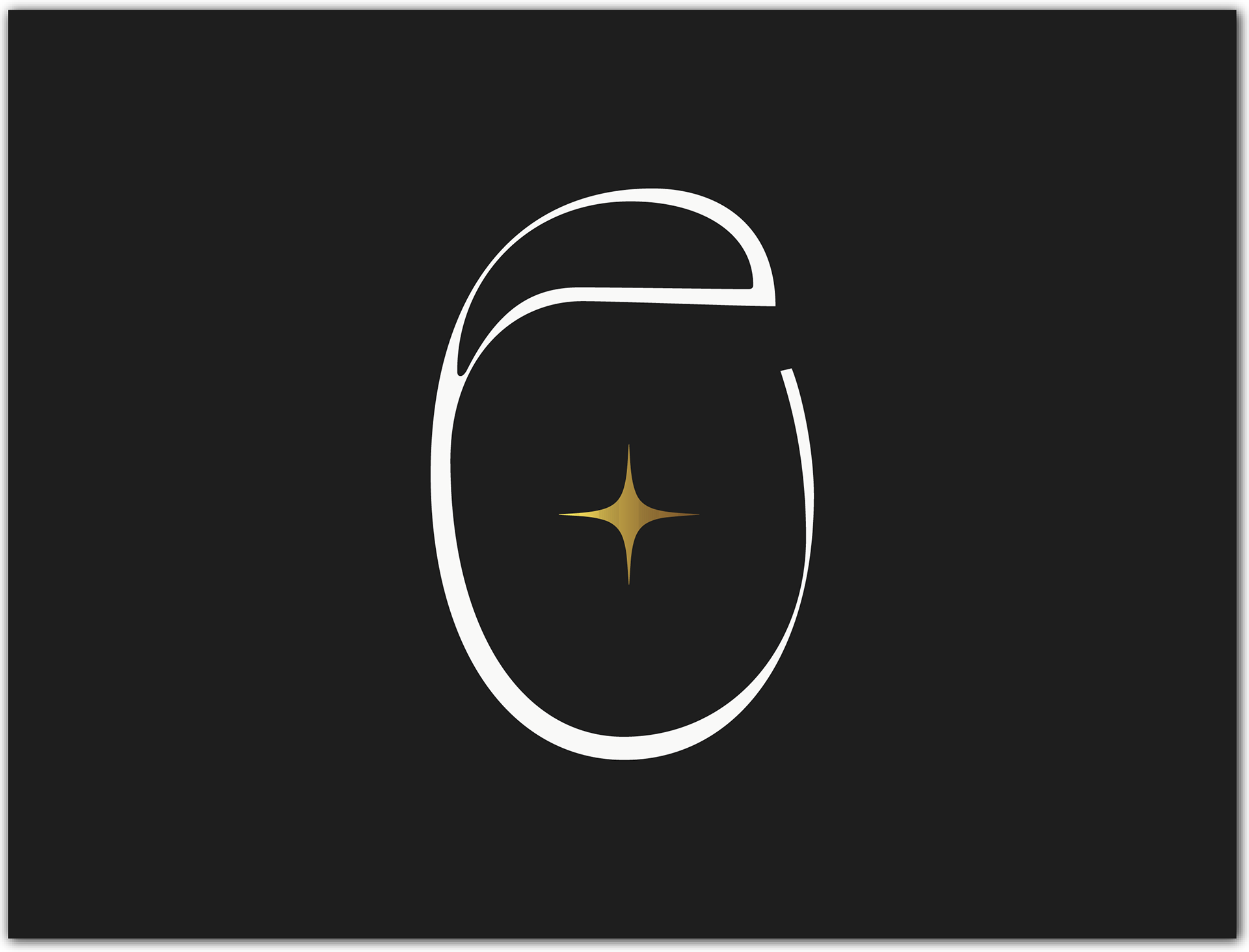
• the refined symbol element adds a distinctive and recognizable signature;
• clean, geometric, cursive letterforms express clarity and confidence;
• the refined symbol element adds a distinctive and recognizable signature;
To ensure consistency, the system defines:
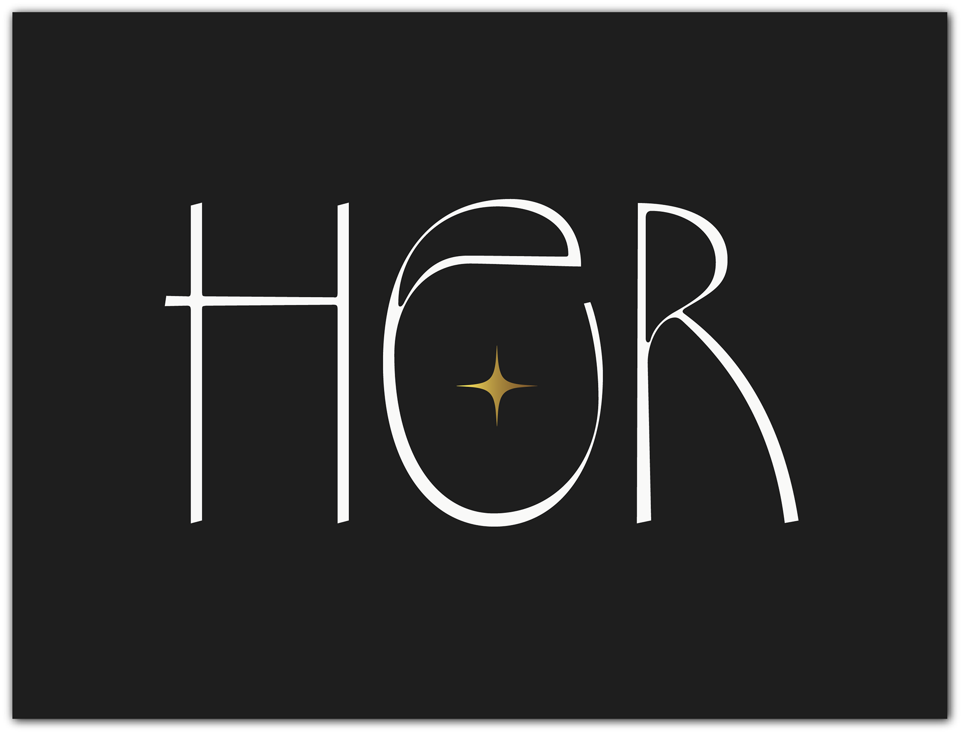
• logo usage on light, dark, and golden metallic backgrounds;
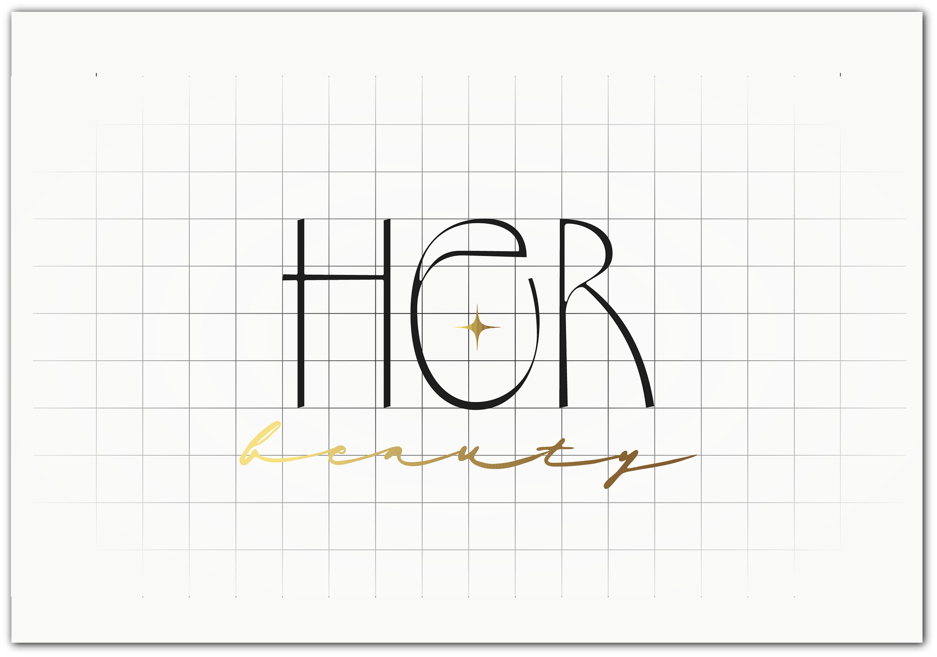
• spacing and alignment rules;
• main logo, secondary logo and mark.
• logo usage on light, dark, and golden metallic backgrounds;
• spacing and alignment rules;
• main logo, secondary logo and mark.

TYPOGRAPHY
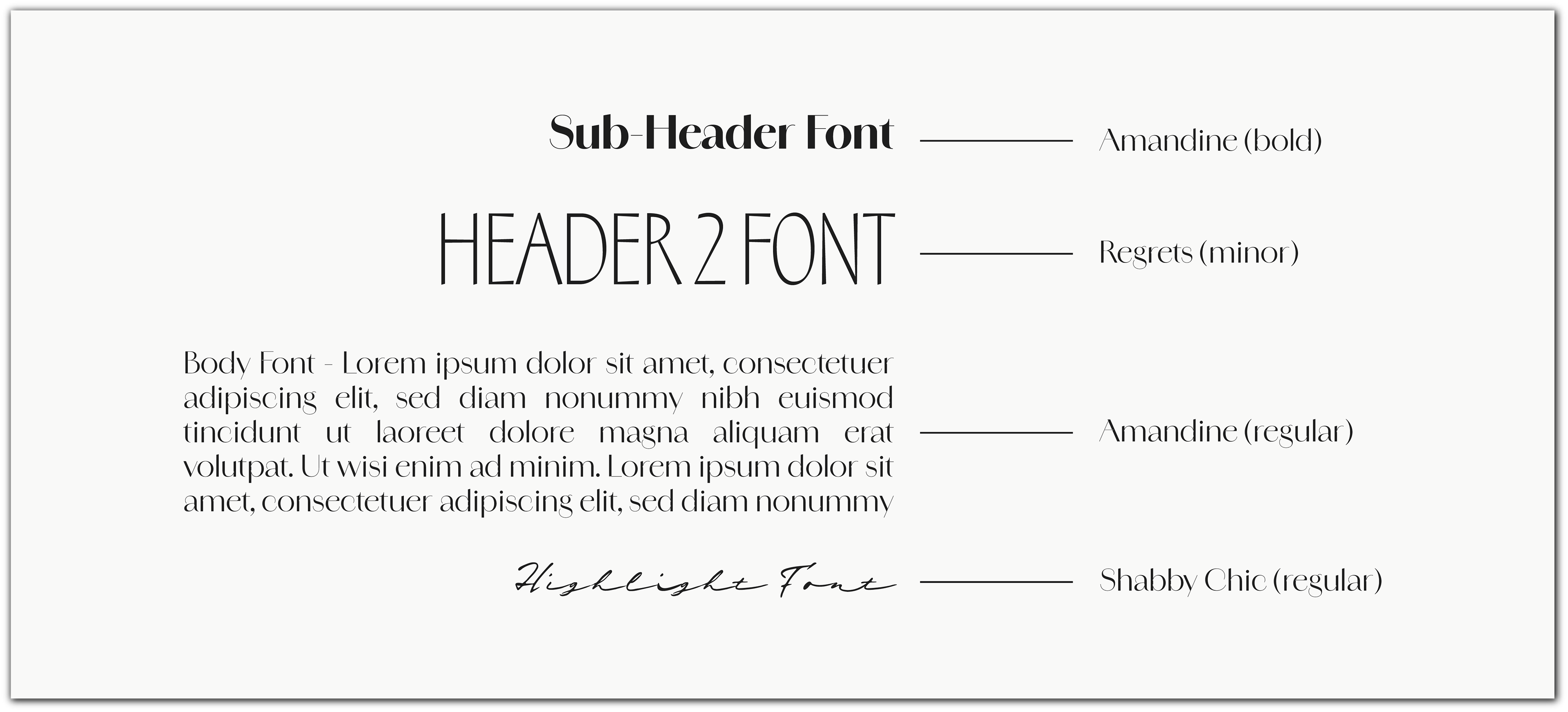
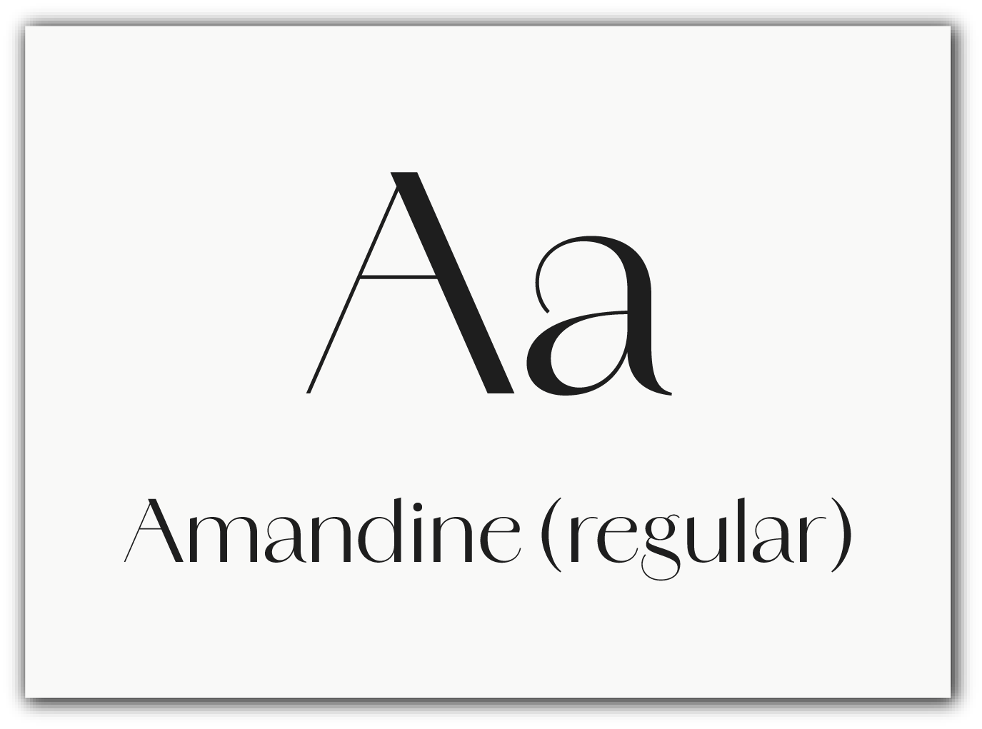
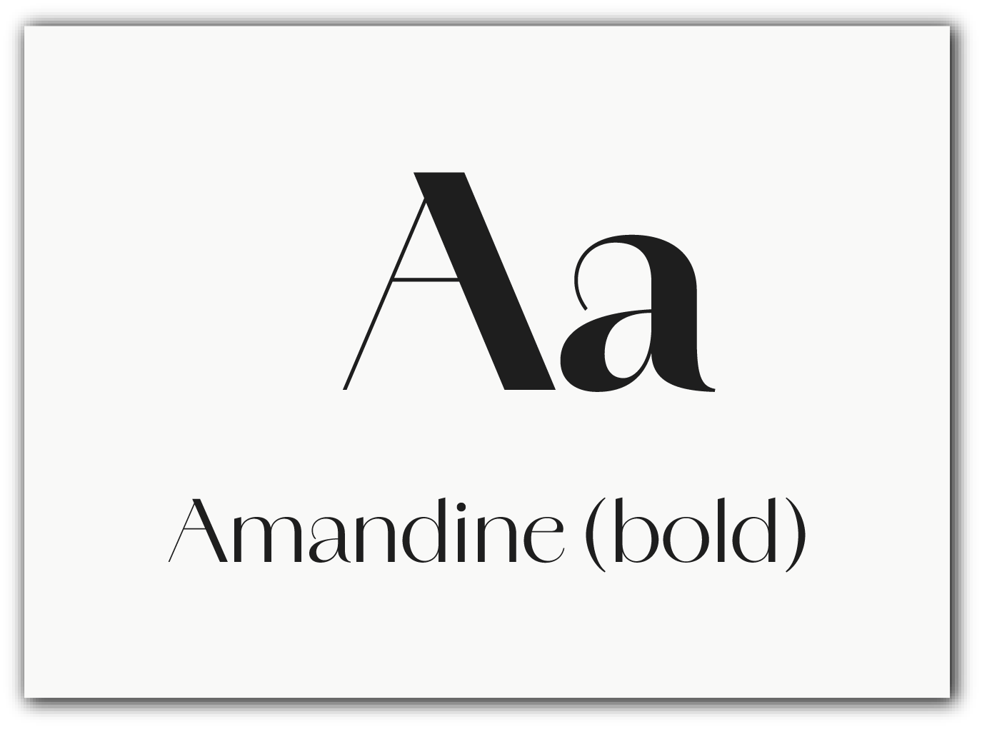
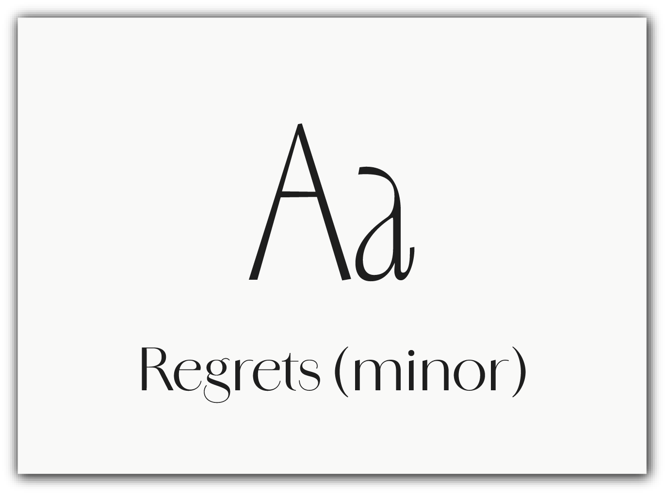
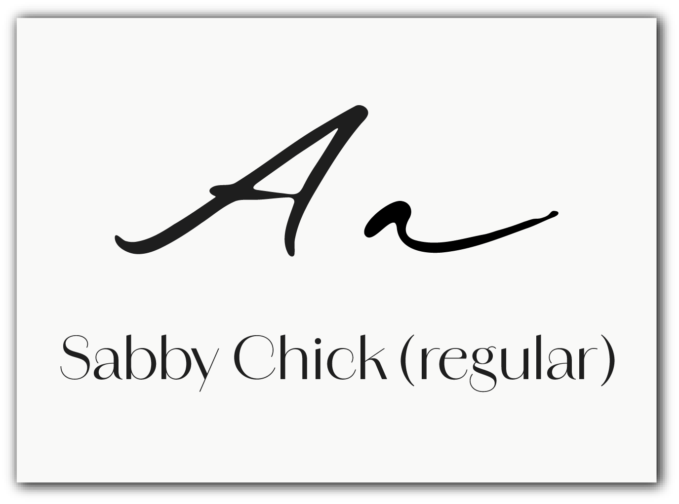
Typography combines modern structure with elegant accents:
• a clean sans-serif ensures readability and clarity;
• a script-style accent font introduces femininity and emotion;
• strong hierarchy supports both packaging and editorial layouts.
• a clean sans-serif ensures readability and clarity;
• a script-style accent font introduces femininity and emotion;
• strong hierarchy supports both packaging and editorial layouts.
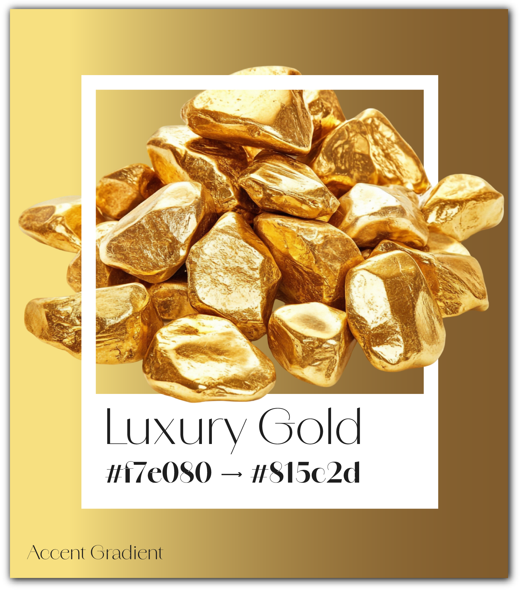
COLOR SYSTEM
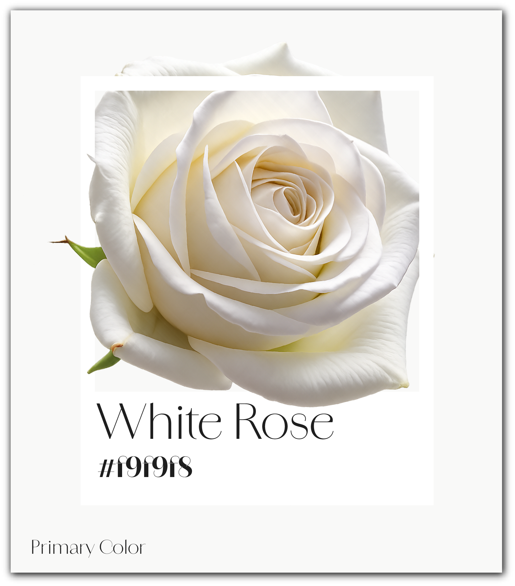
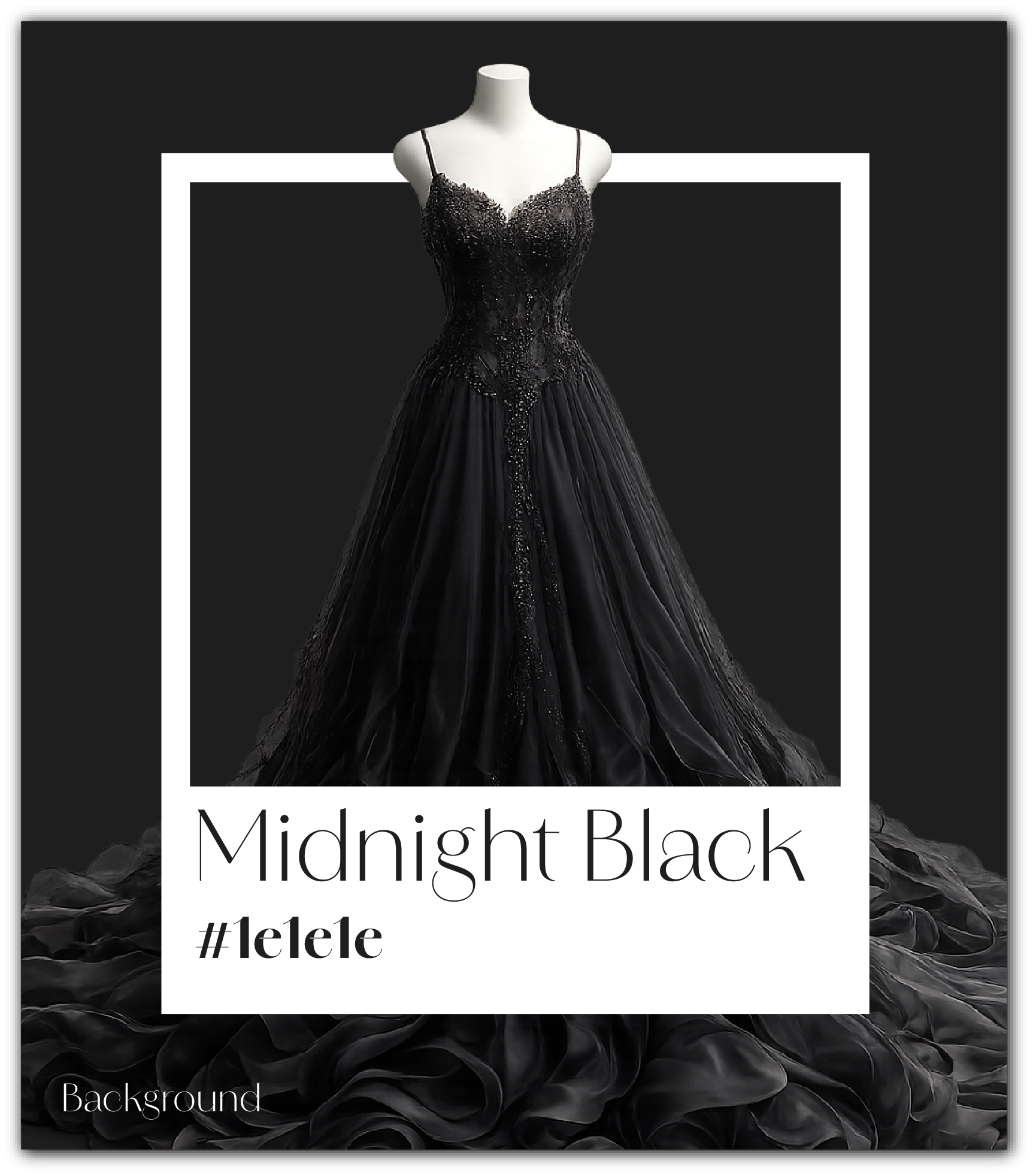
The palette is built around black, white, and gold tones:
• black communicates luxury and depth;
• white adds clarity and balance;
• gold accents elevate the brand into a premium space.
• black communicates luxury and depth;
• white adds clarity and balance;
• gold accents elevate the brand into a premium space.
The system is intentionally restrained to reinforce exclusivity and sophistication.
APPLICATIONS
The identity is applied consistently across all brand touchpoints:
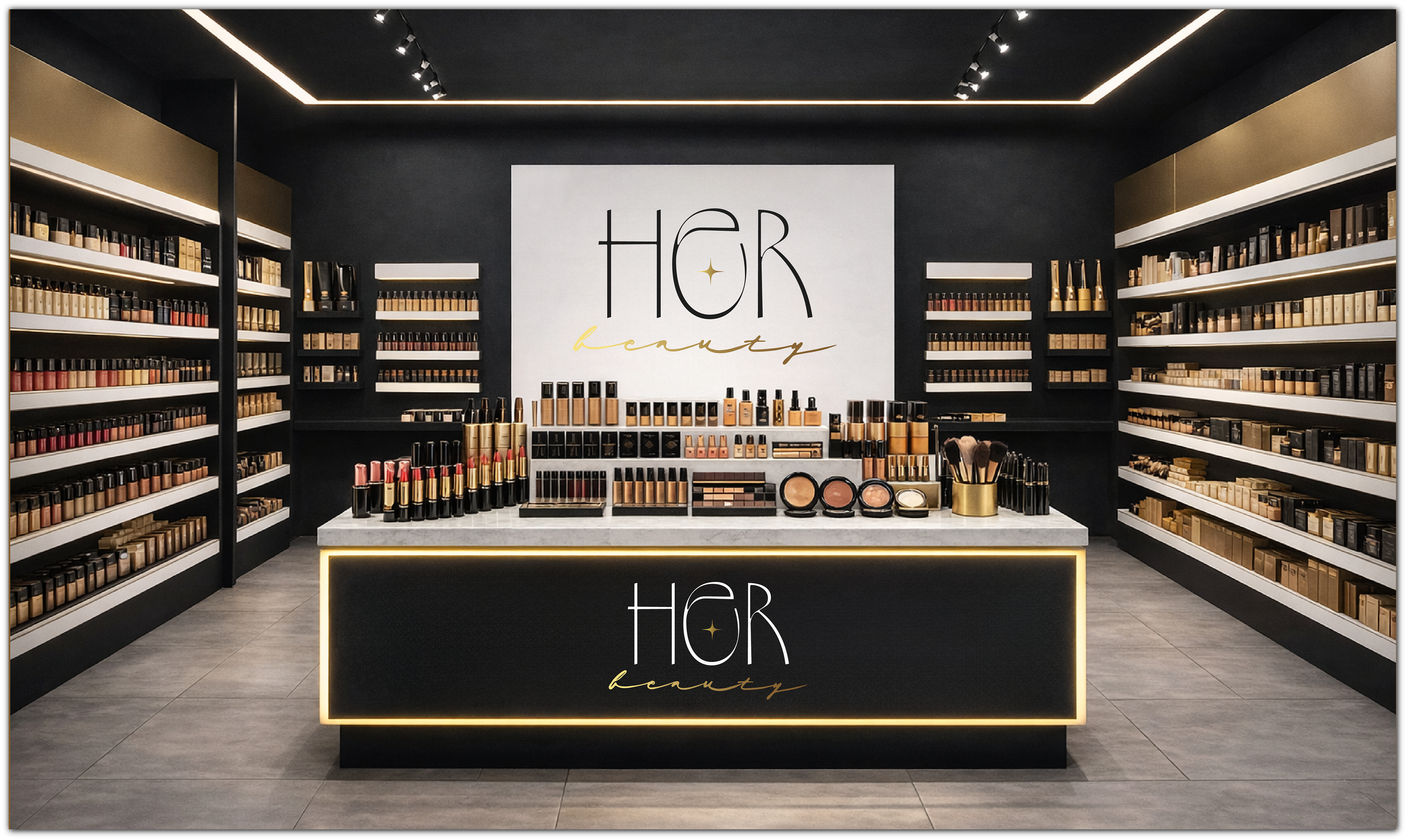
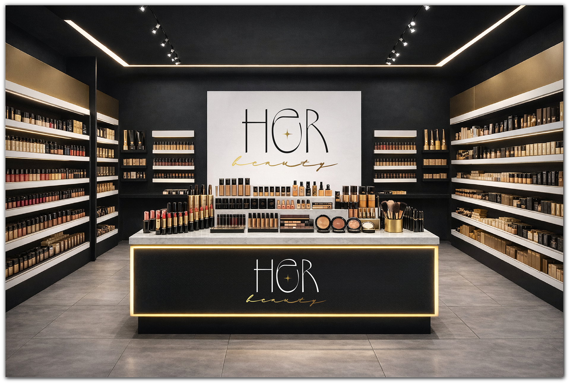
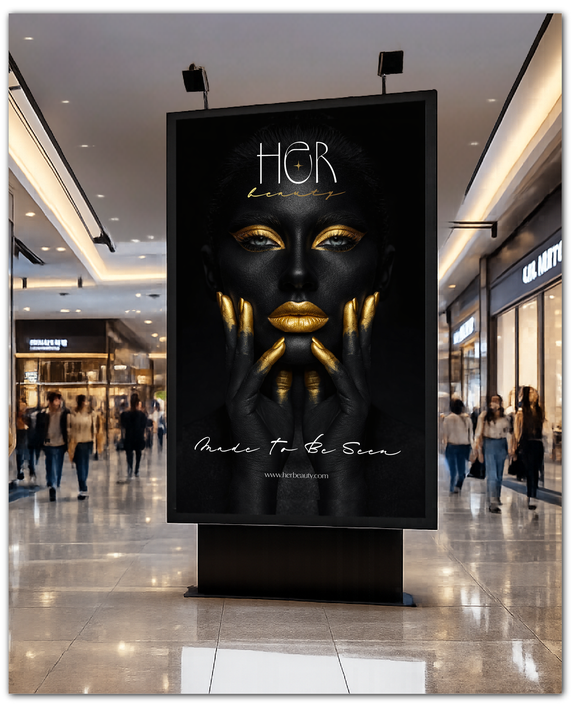
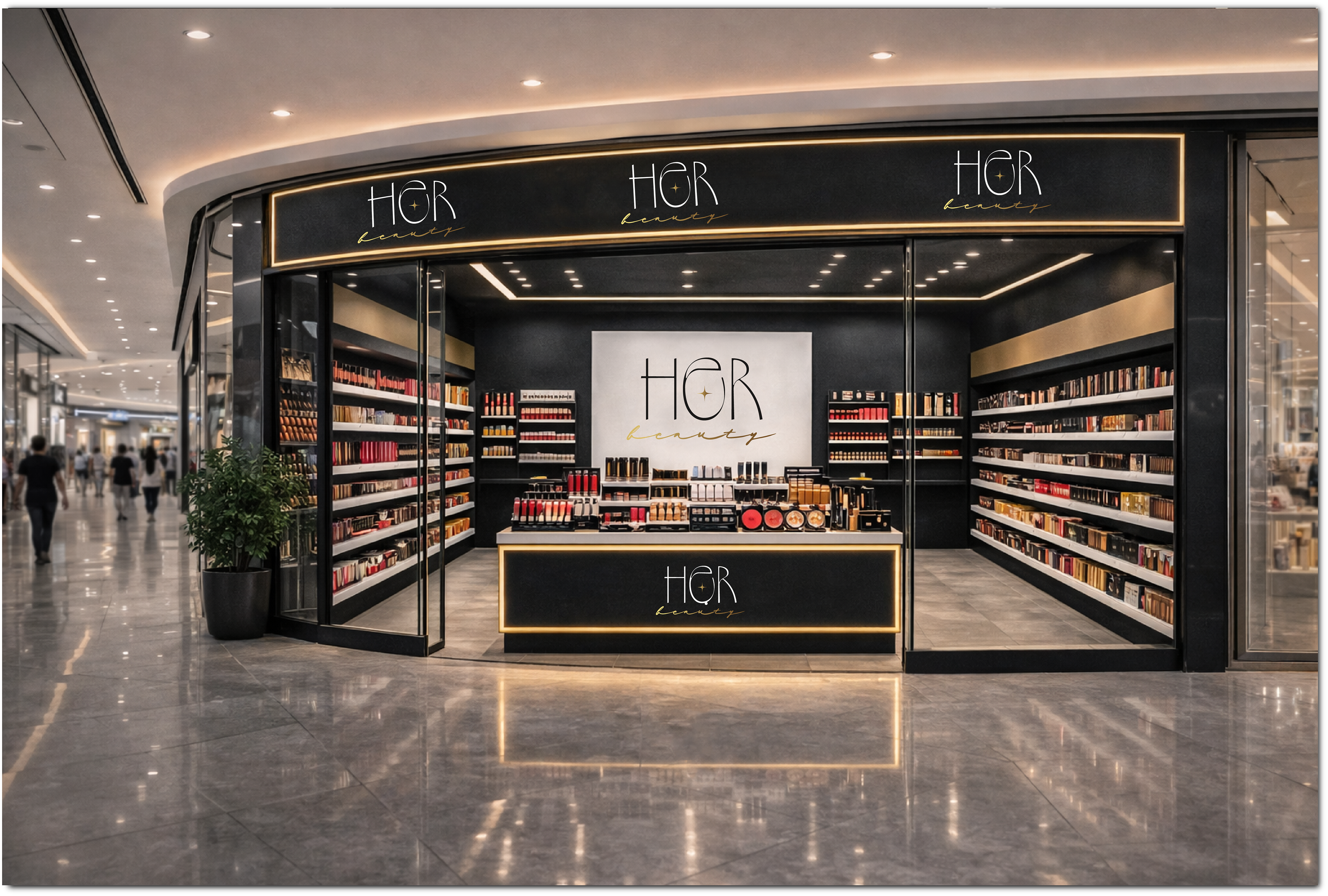
• retail interiors designed as elegant, immersive spaces;
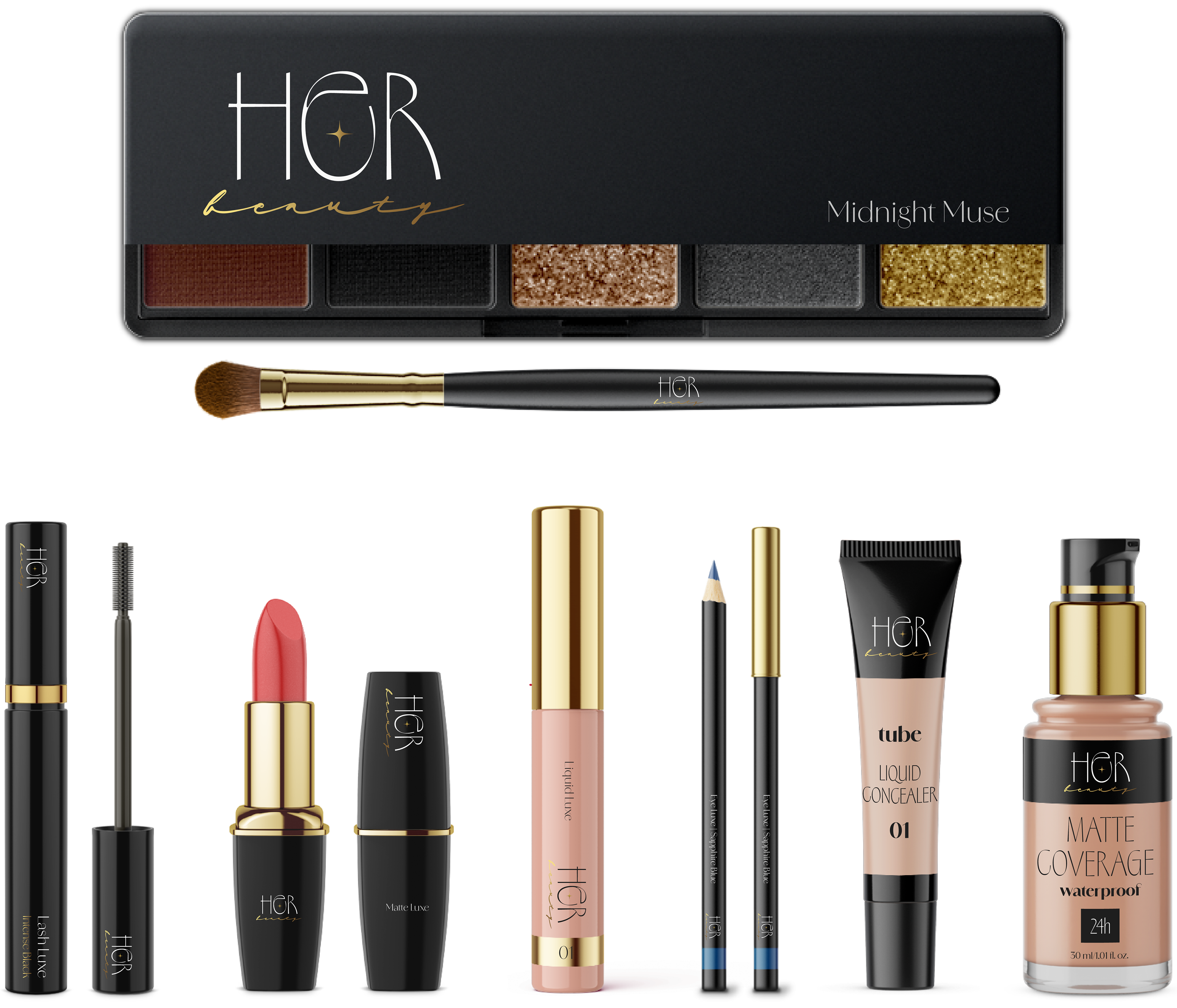
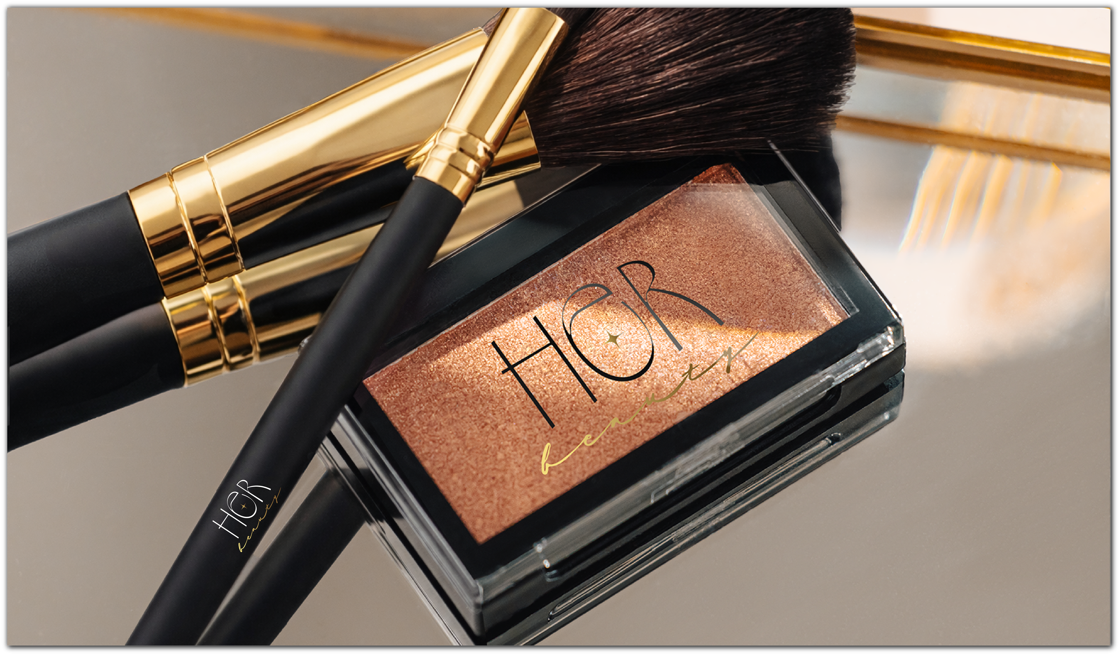
• premium packaging that feels tactile and collectible;
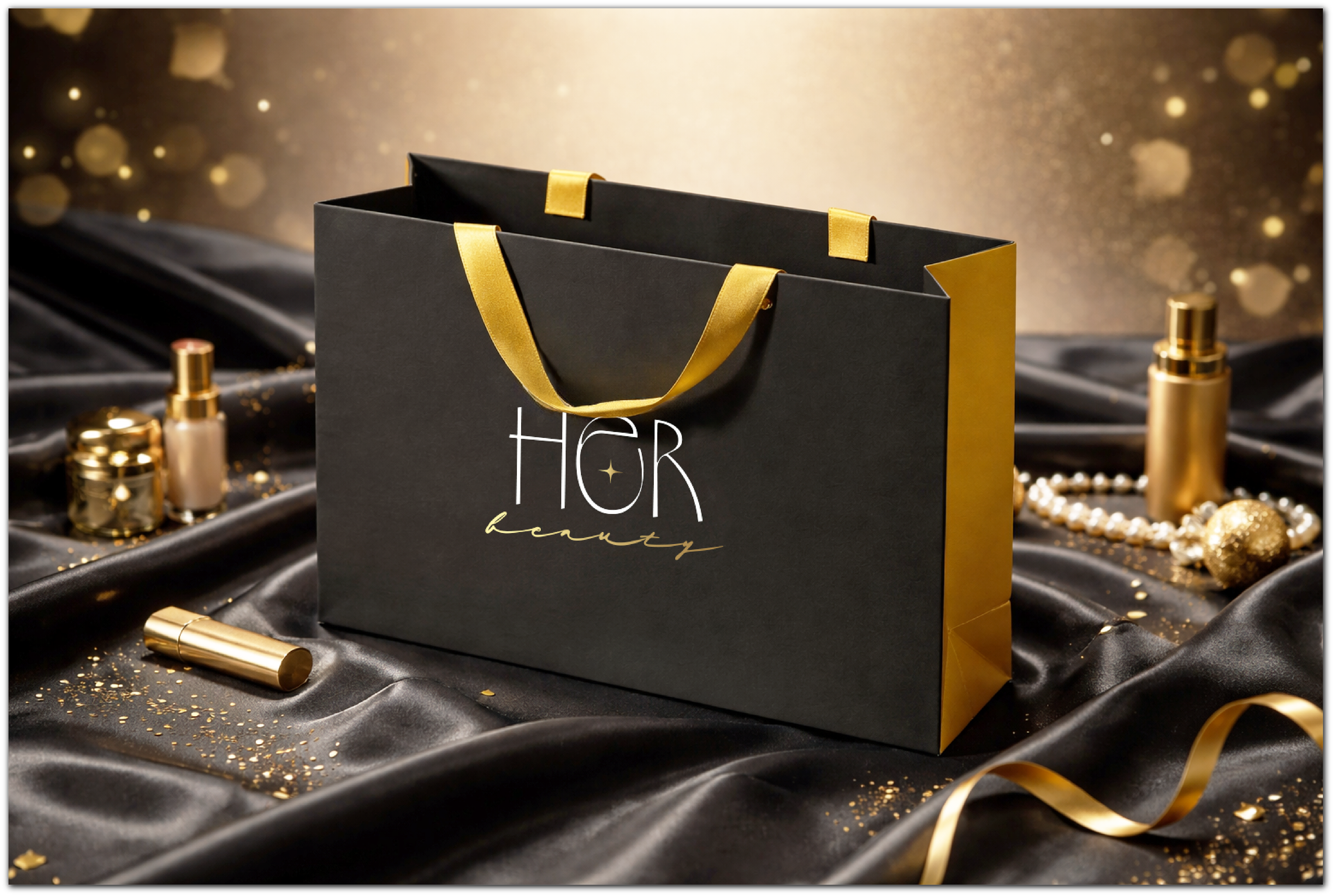
• shopping bags and materials that reinforce luxury perception;
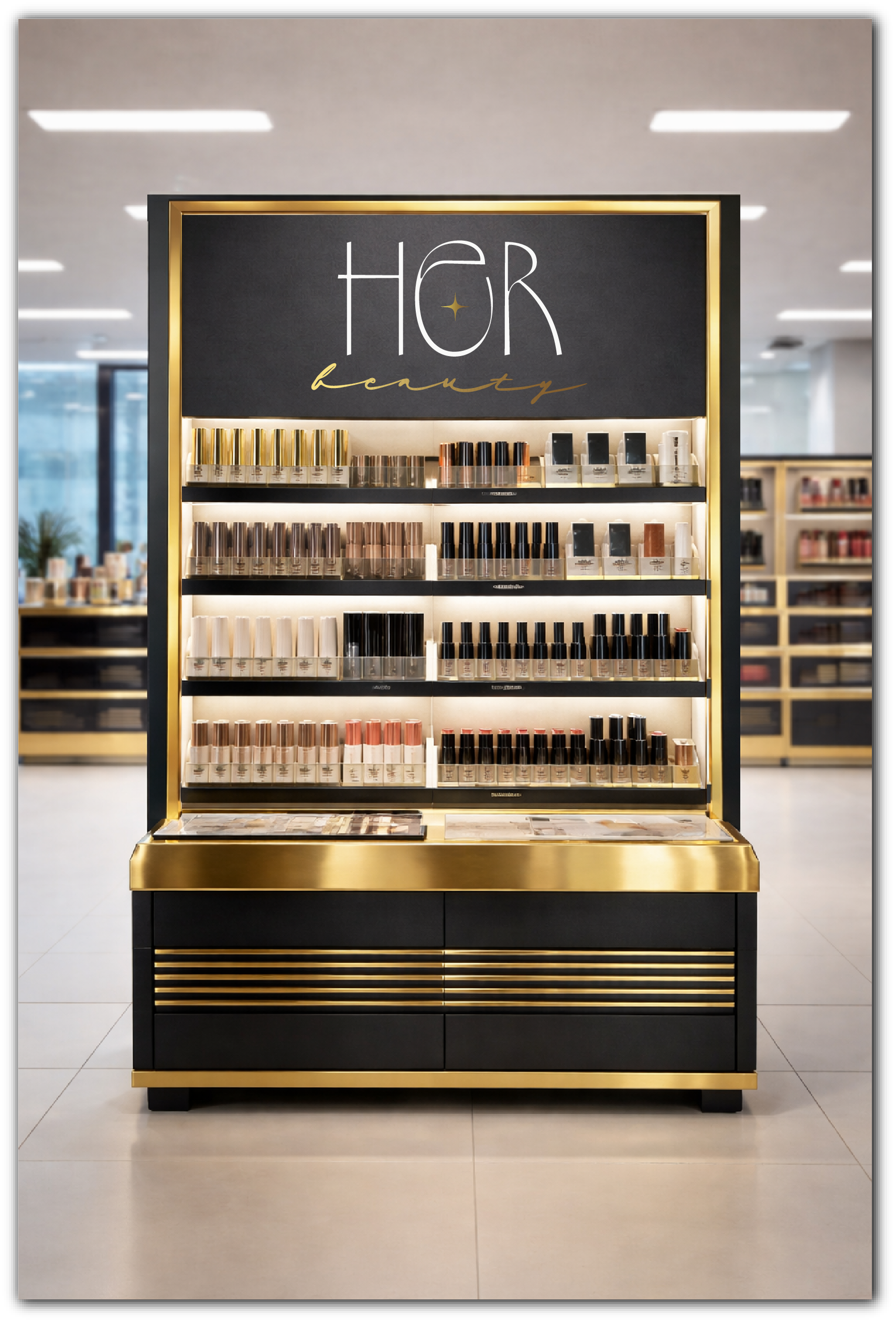
• product displays that highlight minimalism and refinement;
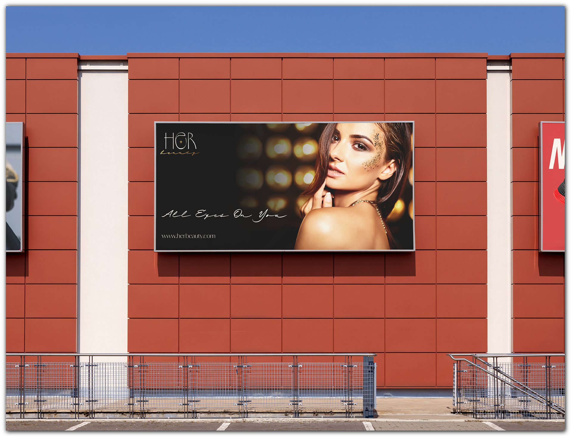
• outdoor promotional banners that extend the brand’s visual language into public space.
• retail interiors designed as elegant, immersive spaces;
• premium packaging that feels tactile and collectible;
• shopping bags and materials that reinforce luxury perception;
• product displays that highlight minimalism and refinement;
• outdoor promotional banners that extend the brand’s visual language into public space.
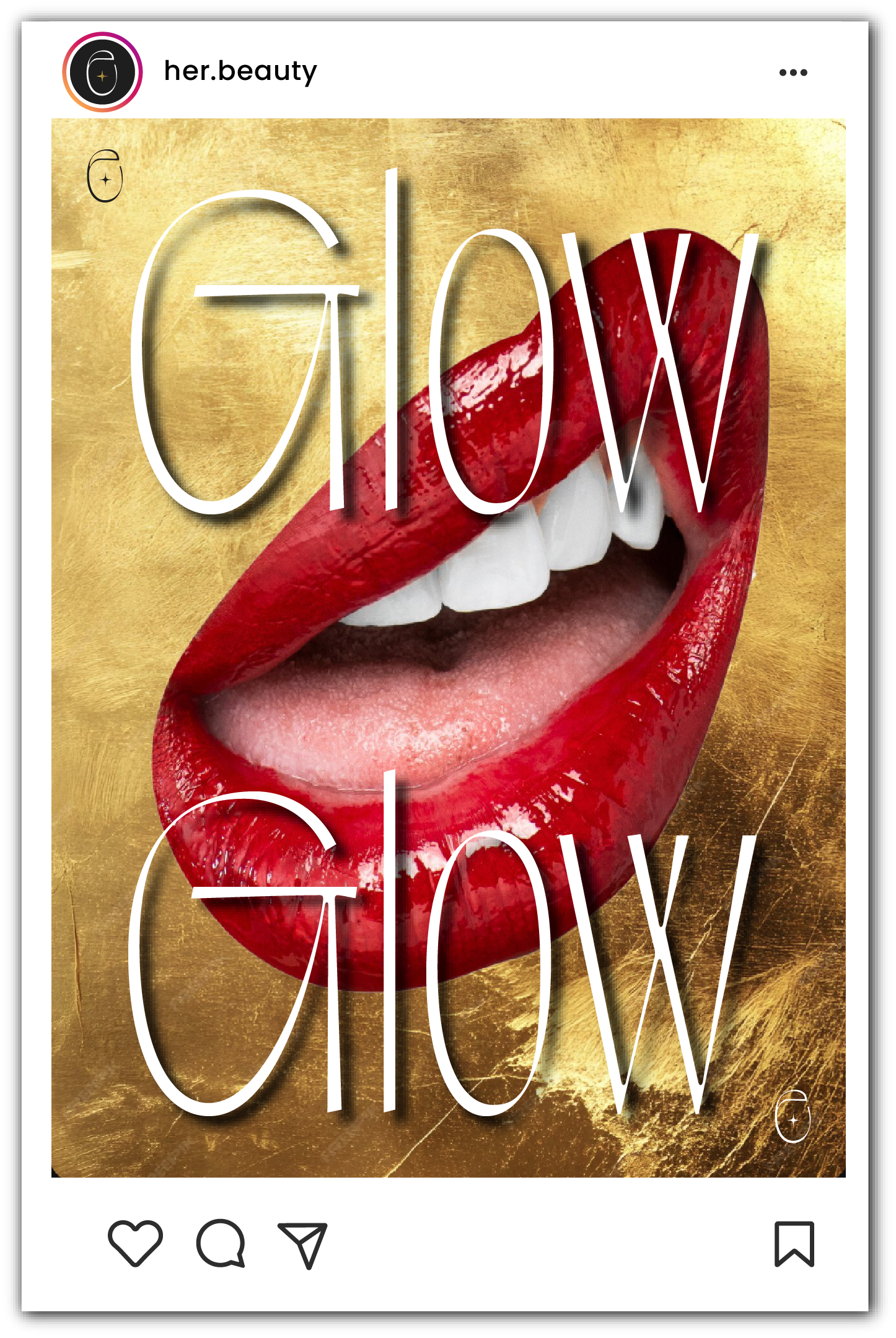
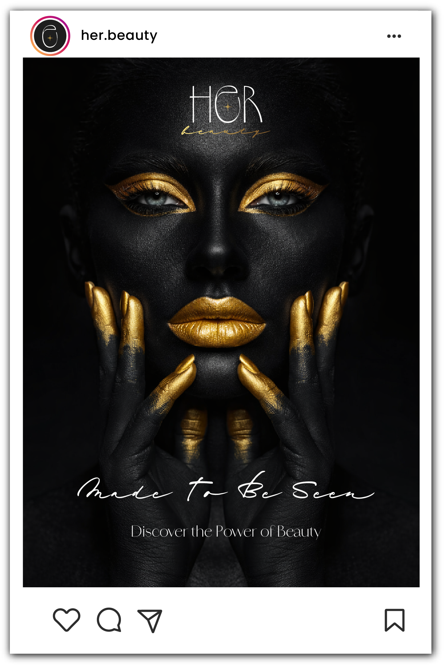
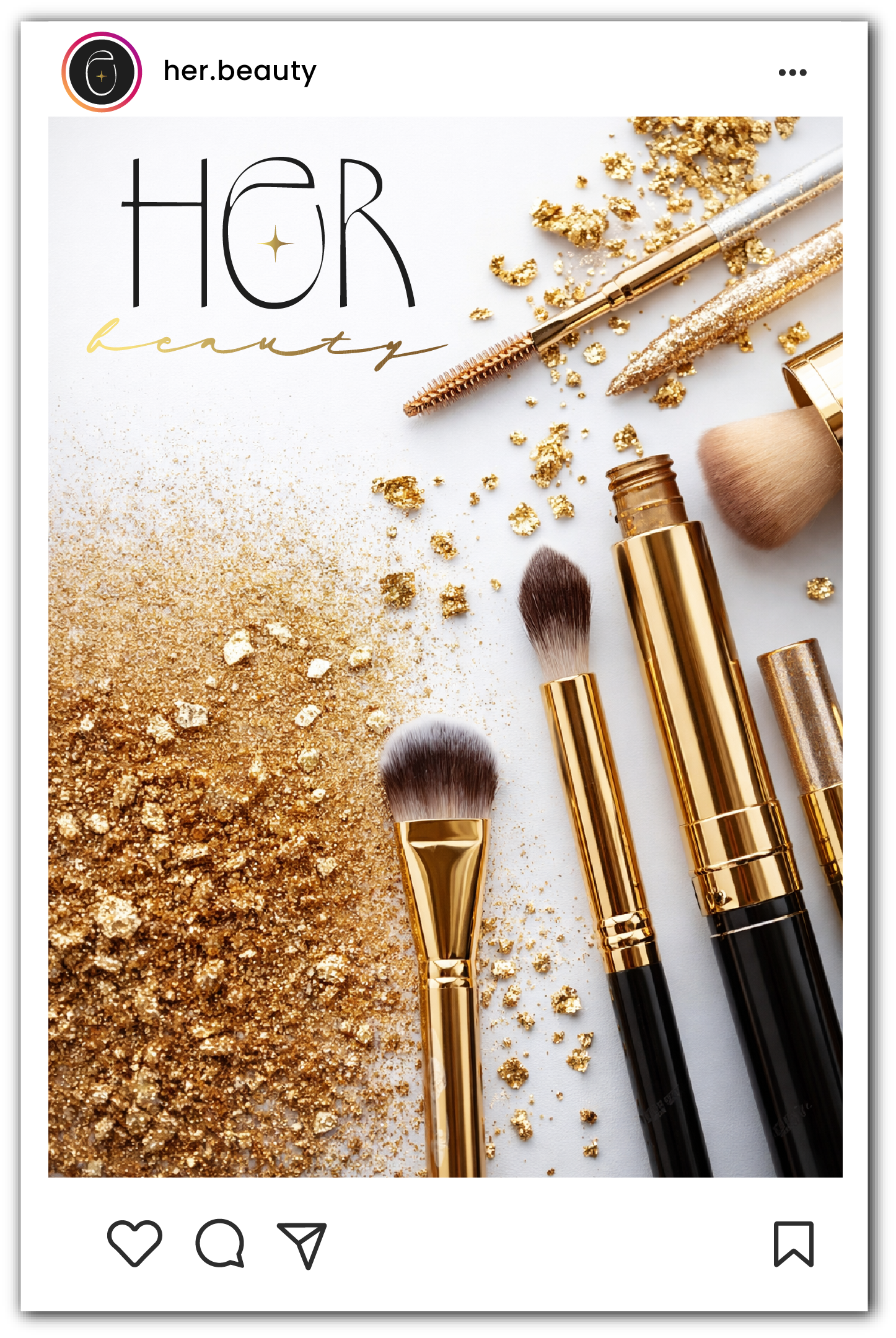
SOCIAL MEDIA
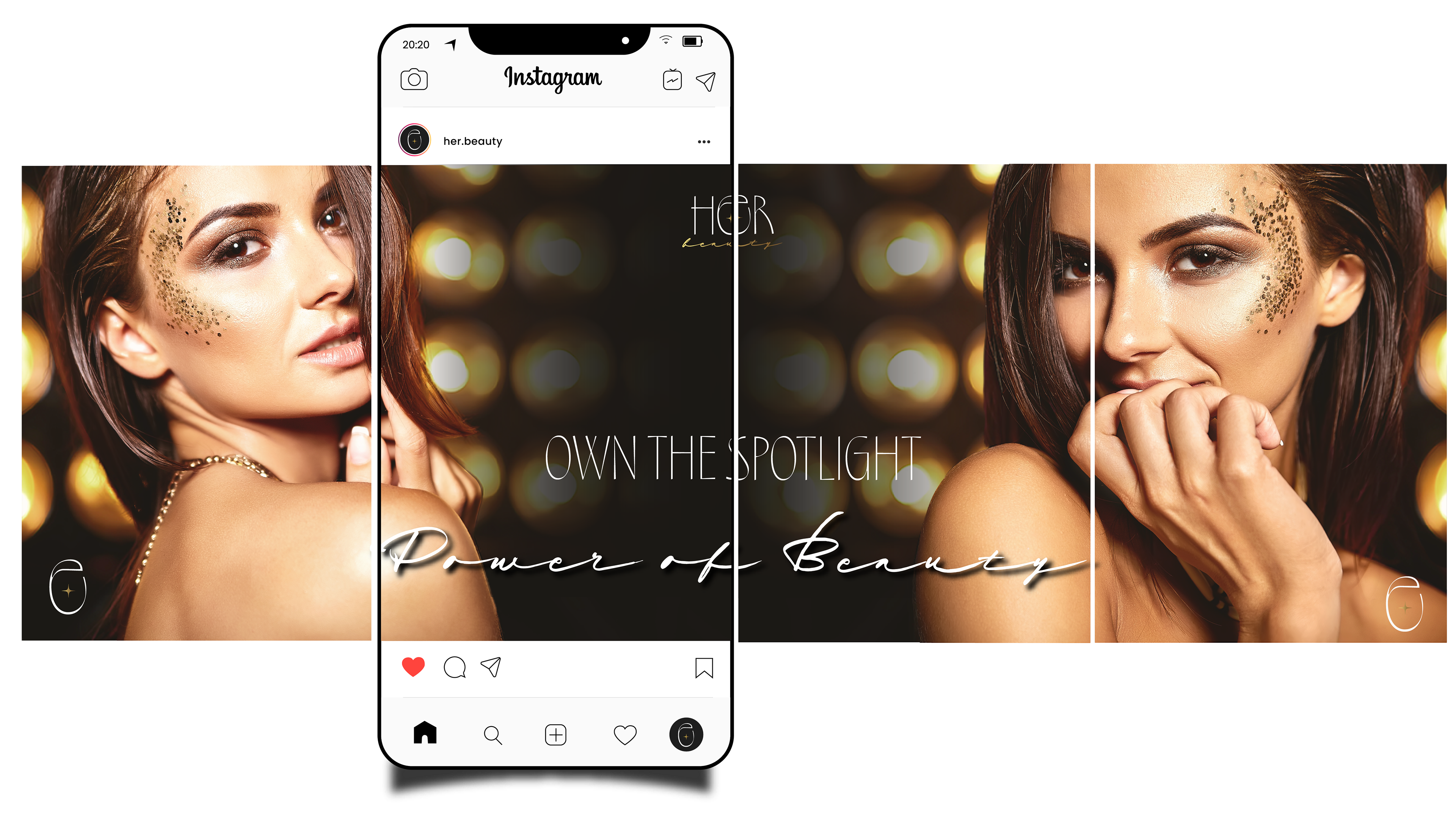
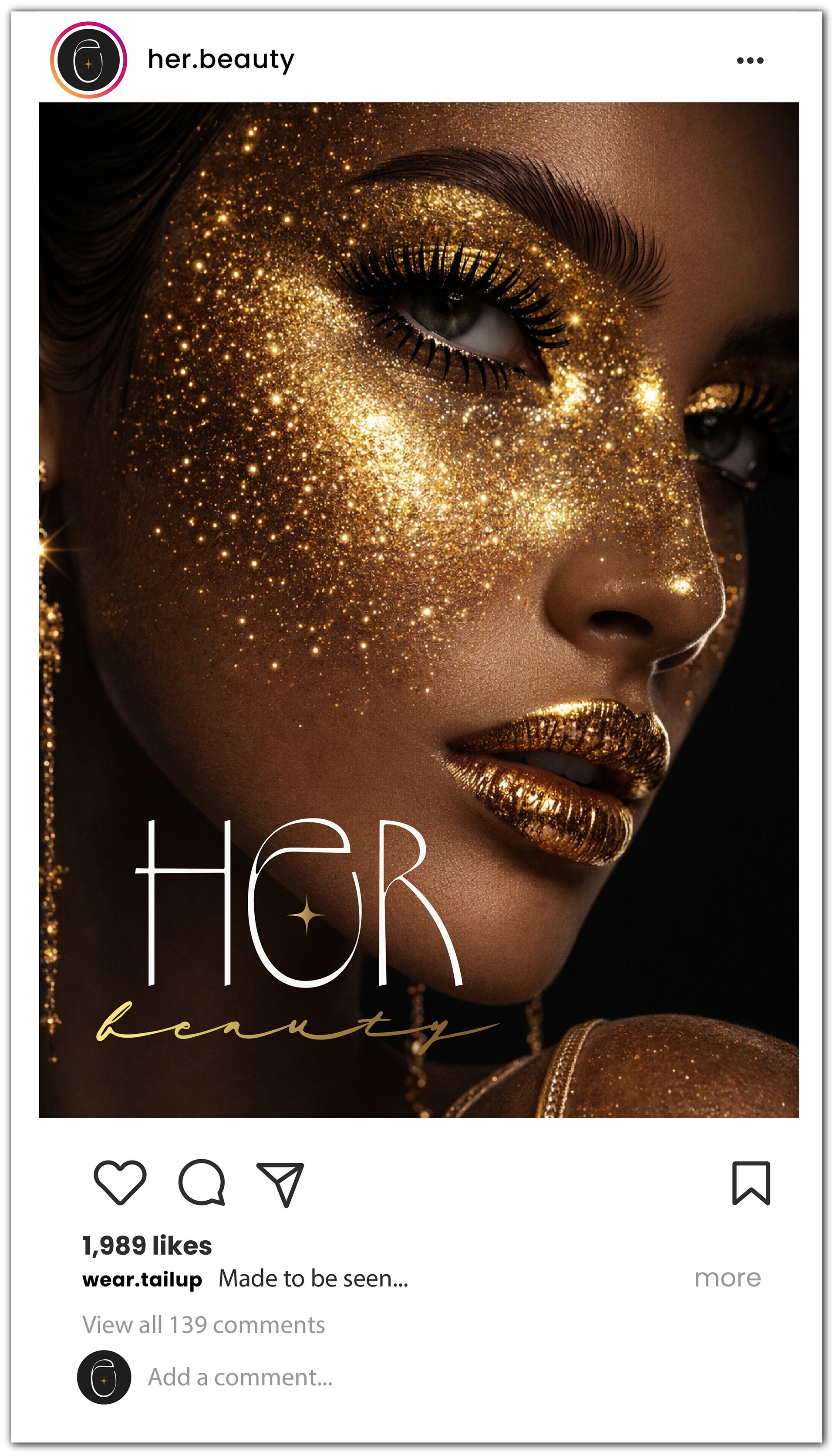
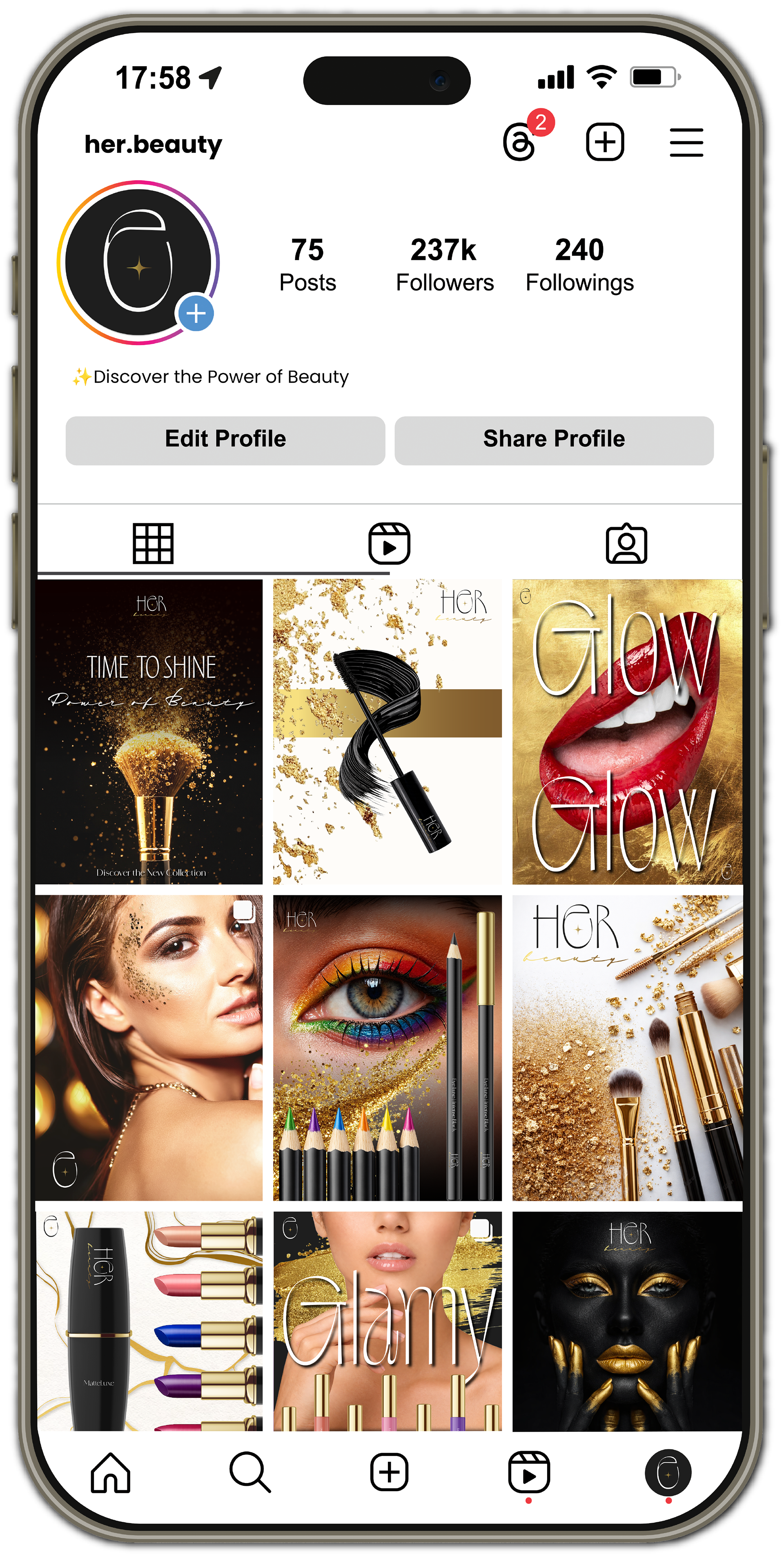
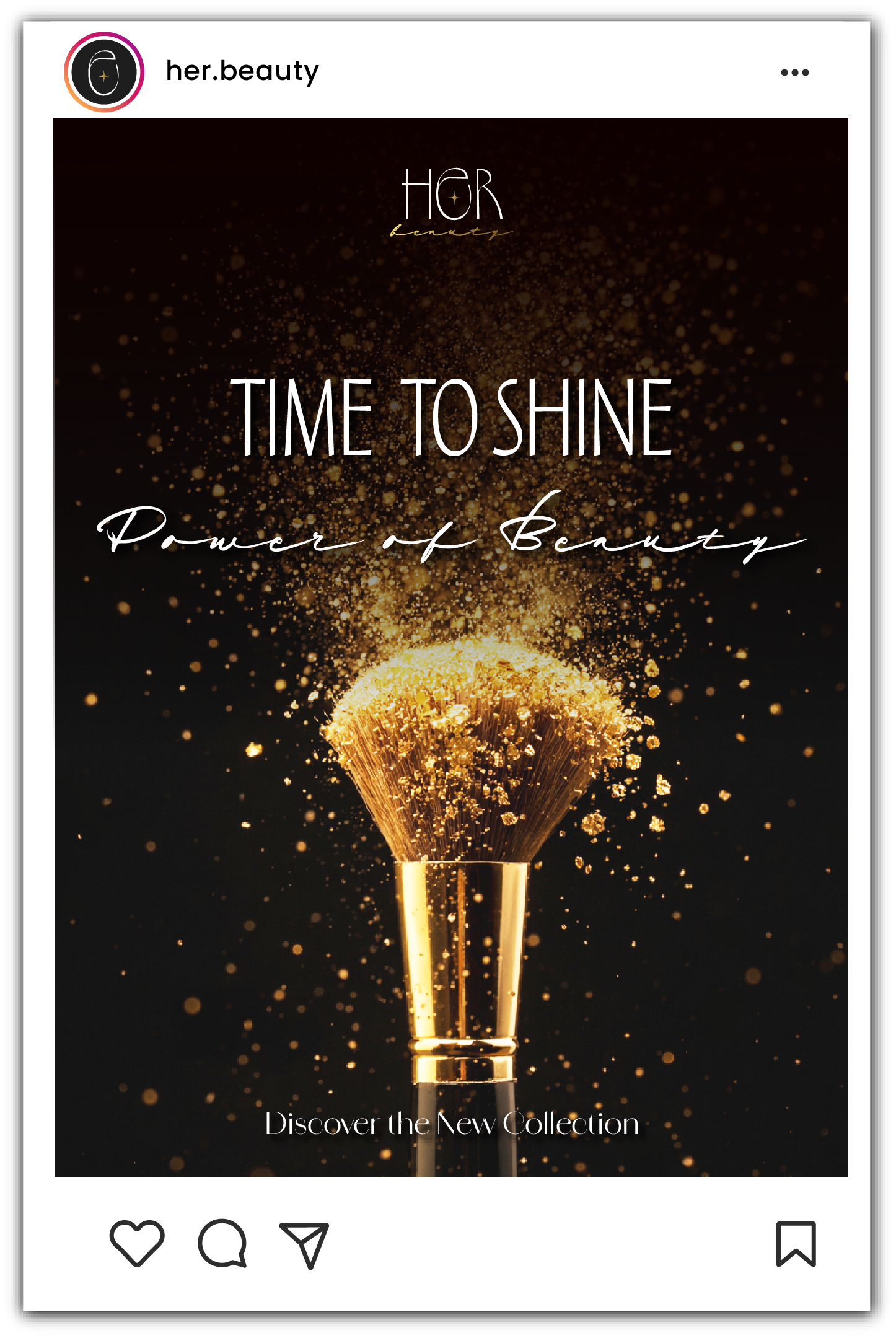
The digital presence follows a polished and aspirational direction:
• high-contrast visuals with clean compositions;
• focus on product beauty and skin textures;
• consistent use of black, white, and gold for recognition.
• high-contrast visuals with clean compositions;
• focus on product beauty and skin textures;
• consistent use of black, white, and gold for recognition.
The strategy aims to:
• position the brand as aspirational yet accessible;
• build a strong and cohesive luxury presence;
• highlight both product and lifestyle.
• position the brand as aspirational yet accessible;
• build a strong and cohesive luxury presence;
• highlight both product and lifestyle.
This project explored how a cosmetics brand could achieve a premium positioning through restraint, elegance, and a highly controlled visual language.
A complete visual identity crafted by me, demonstrating concept development, design execution, and strategic application.